All artwork and concepts by Frankie Tresser, please contact for use or future commissions
Flag of Mt.Tabor
11/13/19
Project:Class assignment
Class: CORE:Space
Project:Class assignment
Class: CORE:Space
Flag video
llama graphics
3/11/19
Project:Self Run
Medium:Graphic design
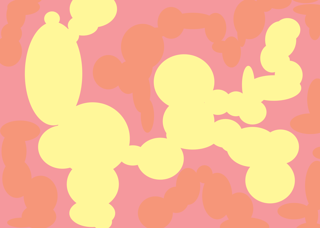
Objective: Working with illustrator, I decided to create a graphic of a llama. I saw one the other day, so I thought it would be a cool and unique subject for this project. I did two different background for this project, and I am happy with how it turned out.
Project:Self Run
Medium:Graphic design
Objective: Working with illustrator, I decided to create a graphic of a llama. I saw one the other day, so I thought it would be a cool and unique subject for this project. I did two different background for this project, and I am happy with how it turned out.

|

|
crane sunset
|
3/11/19
Project:Self Run Medium: Graphic design Objective: Recently I just got illustrator and have been inspired to draw with it!The other day I saw these beautiful cranes, and wanted to draw them in a sunset setting. This was a really good project to learn the tools of illustrator and practice my skills. I am really proud of how this turned out, and excited to make more. With that I also included four different color ways. I wanted to experiment with different color palettes so I included some of my favorite variations. |


|


|
Survivors
|
2/13/19
Project:Class assignment Class:IB Art Objective: This piece was created in response to my Comparative study in IB art. A comparative study is where I take 2 artists, 3 pieces of work and compare them visually and also culturally. For mine I chose Kehinde Wiley and Tawny Chatmon to study. I created my piece based off that, and my own vision for the project. Artist Statement:I want this piece to represent the women who are coming out against sexual assault as apart of the Me Too movement. So many felt they couldn't speak out against horrendous acts that happened to them, but of this past year and currently so many have found the strength to stand up and speak out .It saddens me so much how women have been scared or ashamed to speak out, many being threatened if they do. This is to celebrate the Me Too movement, and the amazing people who are working to change rape culture in the United States. This movement has empowered women to speak out, and come forward.I think it would be really cool to have this piece represent that, show faces of those who felt like they didn’t have a place to hear their voice. Who were once in hiding (Camo) but then spoke out and gave power to so many women to speak out and challenge how our society handles sexual assault. |

Size:40cmX30.5cm
Medium: Acrylic on canvas, with Oil based paint pen |
For my audience, I want them to visualize the metaphor that is within this. A few of the faces I have put I want to have lines coming down from their eyes to represent the crying and emotions that they feel. Sexual assault is very traumatic thing, causing so much emotional pain. For the viewer my goal is for them to see the pain and emotion they might have, even though it might not be fully apparent because so many women hide and feel ashamed to speak to people about what happened to them.
My end goal for this piece to is celebrate the amazing women who have come out with their stories, and working to change the culture in society where women feel scared to talk about horrific things done upon them. To empower those who haven’t, give them strength to call out this society of making women feel ashamed to speak about it. Those who hid their pain, but came out to speak out against the assaulters and share their story. The Me Too movement gave so many women strength, and I wanted to represent that in my piece.
My end goal for this piece to is celebrate the amazing women who have come out with their stories, and working to change the culture in society where women feel scared to talk about horrific things done upon them. To empower those who haven’t, give them strength to call out this society of making women feel ashamed to speak about it. Those who hid their pain, but came out to speak out against the assaulters and share their story. The Me Too movement gave so many women strength, and I wanted to represent that in my piece.
21 Helmets art piece
12/1/2018-12/9/18
Project: Class/Exhibited art piece
Class: IB Visual Arts
Objective: I was approached by my art teacher about a really cool opportunity from SEE SEE Motorcycles, a motorcycle shop and cafe. Every year they do an art show called "21 Helmets," featuring local artists in Portland. The goal for this project is to design/create your art form on top of a motorcycle helmet, customizing it to you. Artists can use any materials, the helmet is yours to create. I was so excited about this project I of course said yes! This year is featuring Portland Public High School artists. Each high school gets 2 helmets, 2 ambassadors to create their art form on the helmet.I represented my high school Cleveland HS.
It definitely was a process. I have never worked with a helmet before, and figuring out my design was a challenge. Over time it developed, and I am really proud of how it turned out. I spent a lot of time making sure each leaf had perfect lines and really reflected my art form. I loved being able to experiment with the colors and pattern and I feel it truly matched my art form.
Honors: This helmet was apart of the 21 Helmets art show put on by SEE SEE Motorcycle cafe. It was featured in the yearly show bringing 300 people to view the helmets. It was also featured in the One Moto show, a yearly Motorcycle convention in the Portland area welcoming 15,000 attendees. I am so thankful for this opportunity to feature my work, and have this helmet displayed. It definitely was a challenge, but it helped me grow as an artist and I am extremely proud of how it turned out.
|
Artist Statement
My piece for the 21 Helmets art show explores the use of color and graphic. I recently was in California seeing the beautiful palm trees that encompass it. I wanted to create a graphic of the palms with the use of colors I typically don’t see on motorcycle helmets. While developing this graphic, much of the helmet was created through experimentation. I played around with the shapes on the helmet, seeing how the flow of the palms were. I got reminded of older movies in California, with people cruising along the coast. After many trial and errors, I found a pattern that I feel reflects the movement I see in palms. I watched some older footage of surfing in California, with surfers doing insane tricks in the bright blue sea, inspiring the use of blue for the palm leaves. I further created wave like shapes within some of the palms. |


|


|
With that I wanted to add some 3D elements to the helmet using a technique I am very familiar to. Drawing hot glue formations on parchment paper so that you get a 3D piece. I have used this technique in a few of my recent pieces and I wanted to include this for my piece. While looking through old surfing videos, some of the footage reminded me of coral reefs in the Pacific Ocean. So I decided to make little coral like pieces out of the hot glue shapes.
I wanted to dedicate this piece to my uncle who was a flat track motorcycle racer. Andy Tresser, National #91 was extremely passionate about racing, fixing, and painting motorcycles. Andy raced a Ducati 750 and Wood Rotax, traveling across the USA competing on them. He won one AMA Grand National and three AMA 600cc Nationals in 1993-1996. Being able to paint my own helmet truly means a lot to me in honor of him and my family's history with motorcycles. He passed away in 1997 after a fatal crash while practicing before a race. His love he had for racing lives on, and inspires me everyday.
I wanted to dedicate this piece to my uncle who was a flat track motorcycle racer. Andy Tresser, National #91 was extremely passionate about racing, fixing, and painting motorcycles. Andy raced a Ducati 750 and Wood Rotax, traveling across the USA competing on them. He won one AMA Grand National and three AMA 600cc Nationals in 1993-1996. Being able to paint my own helmet truly means a lot to me in honor of him and my family's history with motorcycles. He passed away in 1997 after a fatal crash while practicing before a race. His love he had for racing lives on, and inspires me everyday.
Dream Variations- Langston Hughes
10/13/18
Project:Class assignment
Class: IB Literature and Language 7-8
Objective: In my English class we have been studying a poet named Langston Hughes. We have been reading his work, especially some of his amazing poems. For this project we were tasked to create an art piece based off of one of his poems called "Dream Variations." The piece could be of any art medium so I chose to do a mix media piece to incorporate a photo of a sunset I got recently. The art piece had to capture the essence of the poem reflecting the meaning and vibe that you get from reading it. There was one particular verse that stood out to me which I put in the corner of the image that I wanted to capture in my piece. Overall I really enjoyed creating an art piece off of Langston Hughes's poem. While reading the poem, you get many visuals while reading it and this is the first visual I got in my head when I read Dream Variations.

|
Exoskeleton
11/14/18
Project:Class assignment
Class:IB art
Objective:This piece that I am creating is continuing with my same theme, with more of a focus on self identity. I felt it was important to do a piece on self identity to show who I am as an artist and how I view myself sometimes.
I wanted to create a piece that includes my love for photography and art. Photography means so much to me, being able to capture a moment in life forever, in a single picture is so cool. I love being artistic in my photography. I especially love manipulating pictures in post production to create these colorful artistic pieces within one picture. It bring attention to it and really makes the image stand out. I feel that creating a piece with 2 types of materials/mediums would really represent my art style, and how I create art.

|

Artist Statement: With how this reflects my self identity, I wanted this piece to be a multi colored reversed picture of myself because I always pride myself in being very original in my work/style. When one person tells me to act/look a certain way I typically go the opposite/reverse route, following my heart and allowing myself to be who I am, and not what other people tell me who I should be. I grew up with a lot of that, I would color and cut my hair in crazy ways and always get told that it was wrong.
|
I first dyed my hair in 1st grade and it was such a pivotal moment in my life because I was able to express myself freely and allow me to feel like an individual. As I do not have colored hair currently, I still like to express myself in my hair and style.
My style has always been very androgynous/tomboy like. I liked being able to express myself in clothing style too, but this then led people to say I am not feminine enough. I wanted to use colors that typically are associated with girls (Pink), but also have it blend into colors associated with boys (blues) to show how I am not one particular thing with my style. I think that fashion should be fashion, and not limit the genders to what they can wear. Anyone should be able to experiment with what they want in fashion.
With that, I want to create little 3D pieces to go on top of my face like armor. This is to show how sometimes I can be very guarded and protective of myself. I have a tendency not to let people into my emotions right away. I keep them close to my soul. I have been trying to work on myself to be able to, but something about sharing my emotions can be very hard for me. Sometimes I find myself not knowing why, but really in the past I would share things and instead of getting supported through my struggles I got left to fight through them on my own. I had my parents by my side which I am so thankful for because they helped me so much too. I did in turn make me a stronger person, but also one who is more guarded.
I want my audience to be able to see who I am as a person and an artist. I work really hard on my pieces, and this one is especially close to my heart because it is about how I view myself. I have grown so much, and many of my past experiences have really shaped me into who I am as a person, and project myself to others. I am strong, compassionate and artistic, and those are 3 things I really pride myself on. I love creating art that shows a glimpse into my thought process and I really want that to be shown in my work.
Honeycomb Blue bee
9/22/18
Art piece title: Anthophila
Project:Class assignment
Class:IB Art
Objective:For IB art, we must complete a piece of artwork every 2-3 weeks. With each piece that we make, it has to have a process portfolio that comes along with it. This process is repeated creating new art to show in our end of the year showcase. This is my work from October 2nd-October 22nd.
Artist Statement:This piece I am creating has a correlation to my last piece of work. I created a butterfly mask that would come from a futuristic world. It had a different color scheme and pattern you wouldn't see with modern day butterflies. I want to follow that theme and create another insect that would be similar to one of our own, but have the colors be of something of a futuristic Earth.Like a reverse/future universe where the colors are the opposite. I chose a bee because I find them incredibly interesting. How they create honeycombs, work for a queen bee and are such an important piece of our ecosystem.
I am choosing this because in current day we are facing a loss in bee population based off of a lot of many environmental choices humans create. I am choosing to put one bee on the canvas instead of a hive to show how their population is dwindling and that it could lead to some very bad consequences to our ecosystem. This futuristic planet I am creating is like the one where if we do not change our actions we could lead into this world that has everything struggling to survive, and adapt un-natural qualities that were not originally. Such as color and size, which my bee will definitely be bigger than a typical bee.


|


|
This piece is important to speak out against the effects of climate change, animal and insect population decline and how our world can change with our actions. We are the dominant species in this world, and other ones are relying on us to protect their own kind. But humans are failing at that, thus having many species be on the decline. And one of the most important ones is bees. Pollination keeps our plants alive, which in turn gives of food hence our survival and survival of other species. I am having only one bee coming back to its honeycomb to show that it is coming back to its home alone, which is starting to happen more and more as we do not take care of our planet.
I am extremely proud of how this piece turned out. It was exactly how envisioned it in my head. The colors work so well together, and the bee itself turned out so great! I'm happy I practiced painting it beforehand to see what worked and what didn't. It fits the aesthetic that I was going for, with the colors and use of mix media. I love how I made the honey combs 3D because it really had that honeycomb effect. I am excited to create more, especially in this theme I am creating.
I am extremely proud of how this piece turned out. It was exactly how envisioned it in my head. The colors work so well together, and the bee itself turned out so great! I'm happy I practiced painting it beforehand to see what worked and what didn't. It fits the aesthetic that I was going for, with the colors and use of mix media. I love how I made the honey combs 3D because it really had that honeycomb effect. I am excited to create more, especially in this theme I am creating.
Oil Pastel Toucan
|
9/4/18
Project:Class assignment Class:Ceramics/Sculptures Objective: In my sculptures and ceramics class, my teacher wanted us to create a piece using oil pastels. As this is not sculptures like the class is named after, the next step with this is to take the picture we drew, then create it into some type of sculpture. I have worked with oil pastels before, but it was a bit ago. I had so much fun creating this toucan. Toucans are such beautiful birds, and I thought it would be perfect for this project. I got real into making this piece, and really like how it turned out. |

|
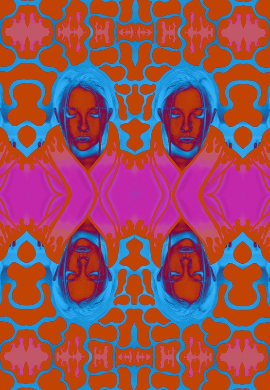
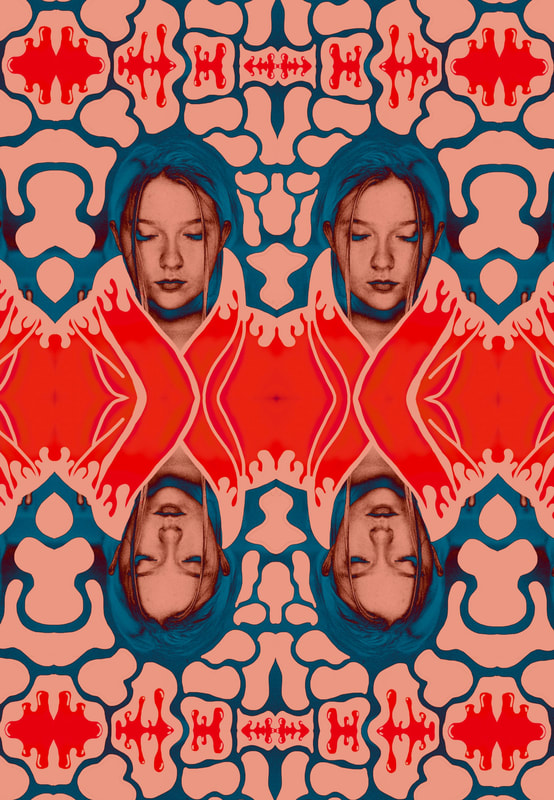
Butterfly mask
Sept. 12-24th 2018
Project:Class assignment
Class:IB Art
Objective: For IB art, we must complete a piece of artwork every 2-3 weeks. With each piece that we make, it has to have a process portfolio that comes along with it. This process portfolio is our documentation of our work. In it we show our thoughts, creative process, progress of the project and every experiment that we do in the end goal of creating an art piece. This process is repeated for every project, and this was my final piece from the dated of September 12th-September 24th.
Artist statement:Typically we start off with picking a piece of artwork from another artist that inspires us. We then create our piece around that. For me I chose an amazing work of art by Yayoi Kusama, 89 year old artist from Japan. This piece is called Repetitive vision.I took inspiration from this piece with its bold prints, and use of mirrors reflecting the pattern that was shown. When I first saw Yayoi’s piece it made me go into a different world. Like and alternative universe that she has created with her thoughts and creativity. When I was thinking what to do for this project, what kept coming to my mind was a clothing piece of some sort that would come from a different universe. Such as uniform that a civilian might have, or clothing royalty would wear. I have these very vivid dreams sometimes and one was about this place where people had very elaborate clothing that were inspired by butterflies.
What I want my audience to see this clothing piece resemble aspects of a butterfly, and that it comes from a different place than ours. I want them to think what type of world this comes from, who would wear this. I want the audience to also create their own interpretation that resides with them. I chose butterflies because they are so beautiful, colors shape and how elegant they are when they fly. I am including aspects of butterflies I think really make them unique, like the shape, the lines within their wings, colors.
Butterflies themselves can be many types of colors, but instead of choosing typical colors we associate with butterflies, I wanted it to have that bold effect that Yayoi portrays in her work. To match the color of the mask, I created butterflies that would resemble the pattern of the mask, like the mask is inspired by these alternate universe butterflies.
Overall I am really proud of how this turned out. It is just like how I envisioned it, but even better. I love being able to build with my hands and seeing my project grow and go through all the different stages. I had a lot of fun experimenting with different types of materials and techniques to make this mask. It definitely makes me want to do more thing like this, creating pieces that could be worn and spark curiosity.


|


|


|

|

|

|

|
The building process
Step one: Make the form
|
While going through my cupboard/closet, I found this perfect un-used mask form. I thought its shape was almost perfect. But it didn't have that winged look of a butterfly that I wanted. So using it as a blank canvas I decided to modify it for my needs. To do that I grabbed my tinfoil in the kitchen to make its shape. I molded it with my hands, cutting it to its shape, and also making sure that the other side was symmetrical. I hot glued every layer so that it would stay put, and be strong for the next step in its process.
|


|


|
Step 2:Felting
|
My next step was felting. I originally was going to do paper machete, but I found this way more efficient, and I also liked how it looked better. I did it in layers, first pink, then yellow and finally blue over the eyes.
|

|

|

|

|

|

|
Step 3: Hot glue overlay technique
|
This was one of my favorite parts to make. I learned this trick where if you put hot glue on parchment paper you are able to make shapes or anything you want. Instead of using felt to make the pattern butterflies have, I wanted to use this technique. So I drew the pattern I wanted on the parchment paper, then created it with hot glue. I made 1 for each side of the mask
|

|

|

|

|

|
I love how this turned out. I originally was going to paint the piece black like a butterfly, but I thought it was so cool transparent. It showed the color through, and also provided a very futuristic vibe to it, which was what I was going for.
Step 4: Butterflies
|
For my final step, and sorta a cherry on top, I wanted to create butterflies for each end of the mask. Like I mentioned previously how I wanted the mask to look like it resembled these butterflies, I painted them the color of the mask. I thought these were a really nice touch and brought the piece in together. I was going to do my hot glue pattern over them, but I am happy that I didn't because I feel it would distract the eye and be a little much.
|

|

|
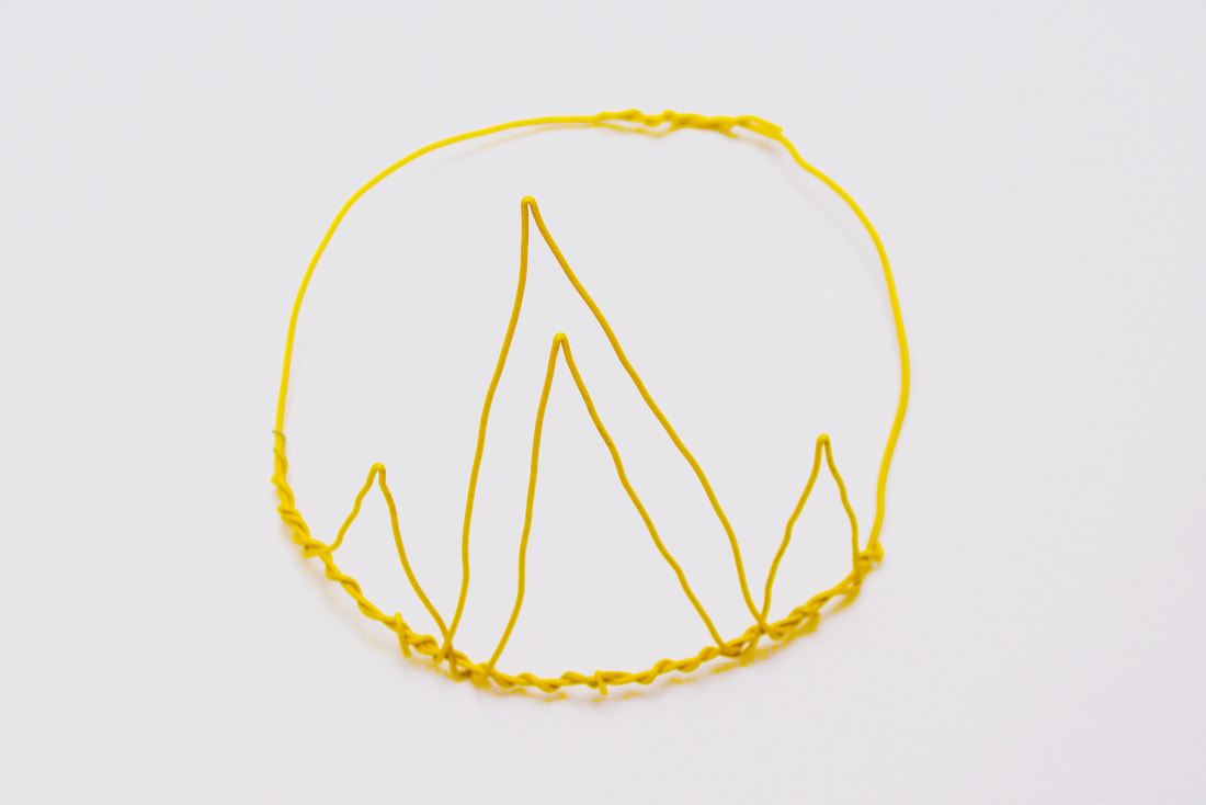
Yellow Wire Crown
8/10/18
Project:Self Run
Objective: While working on a project for IB art, I found this very cool yellow wire. I loved its bright color, and how it was very bold. I wanted to make a bare wire crown, showing its bright color and also very simplistic. I love how this turned out. It looks super cool in pictures. Its reminiscent of traditional crowns, but instead of lavish decorations and ornament pieces on the crown it is just thee wire structure which I think has a really cool aesthetic.

|

|

|

|

|
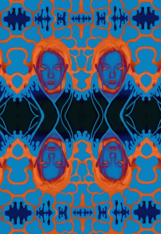
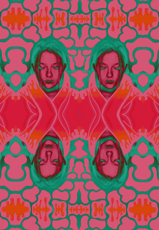
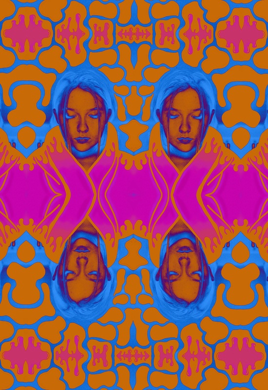
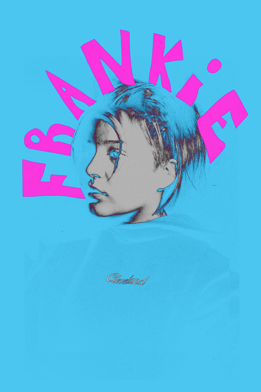
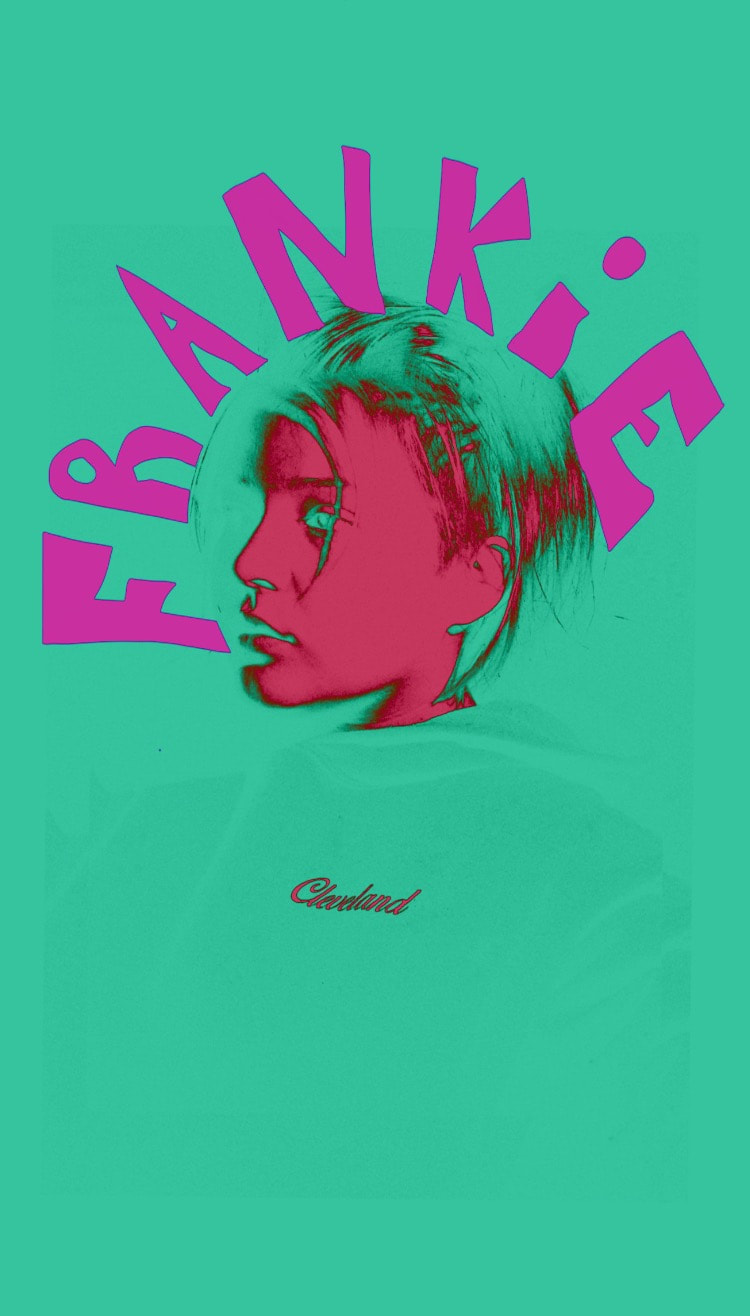
Photography illustration Inverse with mirrored effect
6/8/18
Project: Self run
Objective: Same with the previous project, I took an image and drew some patterns and designs. From there I created a mirrored image that had the image depilated twice into one picture. From there I worked with inverting the different colors to see how they looked. I loved being able to create so many different versions of one image using color. Overall this was really fun to create and I love how the images turned out.
|
|
|
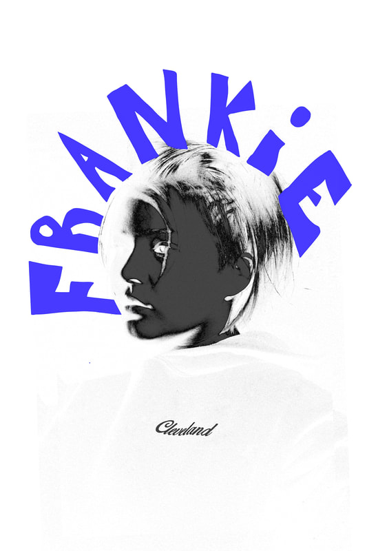
Photograph illustration inverse6/8/18
Project:Self run Objective: Celebrating the last day of school I decided to do a little illustration over some pictures I just took. I created one image with yellow writing, then thought it would be fun to inverse the image in different colors. I feel this came out very successful being able to work with many different inverted colors. I used Sketchbook pro and created the writing around the picture. I loved being able to practice this style and hope to evolve its look with more projects like this. |
|
|
March for our lives magazine series
3/25/18-4/2/18
Project:Class assignment
Class:Graphic Design
Objective: This project correlates with the pictures I took for the March for our lives walkout (Featured in photography page) for a big display I am doing for the school. I wanted something to go along with the images such as visual art with information, quotes and statistics. I created a series of graphics for this mini-magazine, and also did some of my own writing to add onto it. With this discussion of gun control being such a huge topic in the United States, I felt it was important to showcase how my generation is taking initiative to stand up for what they believe in to hopefully make the world, and our education a place where we can feel safe. I hope to also show the story of a victim who never got any media coverage of her death from gun violence at schools.


|


|
#Enough photo graphic
3/21/18
Project: Self run for art display
Class:Graphic design
Objective: With the recent images I took of my High school during our walk out, I decided to make a graphic to spell out the word Enough using the pictures as the words. The word Enough has been one of the main phrases used to describe how the students of the USA feel about the lack of gun control, and the school shootings that are directly effecting our education. I created these images to also be apart of a display of my pictures that will be in the front of the school. It will show all my images, and have this above it..

|

|

|

|

|

|
Communication Magazine3/8/18
Project: Class assignment Class: IB German 5-6 Objective: Today we were assigned to create a writing piece to showcase our new knowledge on the topic of internet and modern day communication in German class. This project was a open project, allowing us to write in any form we want, so I chose to do a magazine! It was great getting to mix my creativity with also my German skills. I chose to discuss what Instagram is, and to tell why it is a form of communication. I have added my magazine into slideshow form like you are flipping through a magazine. |
|
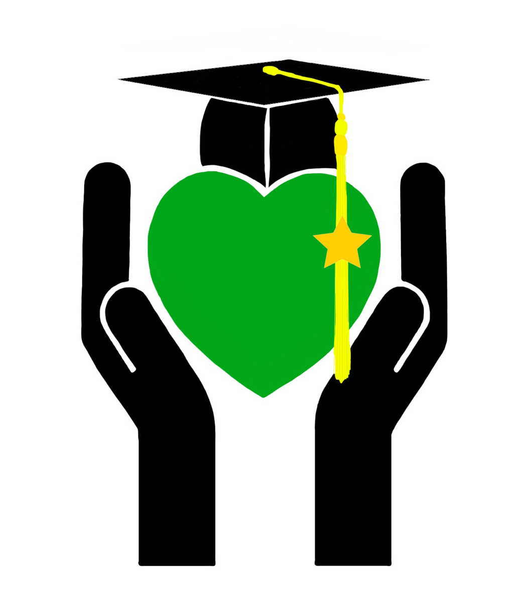
C.H.S logo2/6/18
Project: Class assignment Class: Graphic design Objective: Today we were assigned a project created by an administrator at school to create a logo that would represent CHS. Compassion, Honor, and Scholarship. This phrase is affiliated with our school because our school initials are also CHS. The goal of this project was to create a logo that would be on the posters and other print ads to represent the CHS acronym so when people see the logo, they immediately think of Compassion, Honor, and Scholarship. For this, I created a logo that has each of those elements. The hands and the heart being Compassion, the graduation cap being Scholarship and the star on the tassels representing Honor. I am really happy with how it turned out an to see what how this logo can be used in school marketing. |
|
Photoshop doodles2/6/18
Project: Self run/ Experimental Objective: This project was completed just playing around. I would get the Eclipse tool and fill circles with the two colors to make a fancy pattern. I did all types of circles and ovals, making two mega shapes. Overall I enjoyed being able to make my own print and having fun with Photoshop. |
|
Versus T-Shirt Flyers2/3/18
Project: Class assignment Class: Leadership Objective: For the t-shirts that I designed, I wanted to make a poster that would represent and also present the shirts well. The flyers will be hung up around the school, posted on social media and any other way of advertisement to get the word about the shirts, and hype them up. |

|

|
2018 Versus T-Shirts2/1/18
Project: Class assignment Class: Leadership Objective: On March 14th, 2018 we will have our annual Cleveland High School Versus assembly. The biggest assembly of the year! It is a huge event where the Underclass (9th and 10th grade) is Vs. Upperclass (11th and 12th grade) and Vs the staff in a series of mini games. I was so excited to get asked by our student body president to create the shirts this year. I wanted to make these special, giving every shirt a different pattern. These successfully got voted by the Leadership class, and will be official shirts. |
|
|


Cleveland High School Auction poster
|
1/31/18
Project: Class assignment Class: Digital Media Objective: Today was the first class learning Adobe Photoshop!I have some previous knowledge of the program, but in class, we watched some tutorials and I learned some new features just by trial and error. We were tasked to create a flyer/poster for our upcoming school auction. As the name is called "Camp Cleveland" so for one of my posters I wanted to incorporate some camp vibes. Such as the stars on one of my posters, and a cool effect on another where I layer an image I have when I go to camp with a smoke effect. Overall it was a lot of fun to make these posters, I kept coming up with more and more designs and I wanted to create what I was imagining to represent this event, and to also give our client many options to choose from. Honors: I am so excited to say that my sunset poster got picked by the Auction planners! It got printed out, and posted throughout the school. |


|


|
Devo album cover recreation
1/4/17
Project: Class assignment
Class:Ethnic studies
Objective: In class currently we are doing a genre on music history. Our project we were assigned was to research a genre of music, describe its history, create a ten song playlist and make a cover for this playlist.I choose to do 'New wave', a genre from the late 70s and early 80s. This genre has some my favorite music. I thought it would be fun to use the group Devo's album cover for the song Whip it, and recreate it with my face on each of the band members.This was just a fun little project, that I got to play around with

|

|
Dutch Iris
Finish date:12/15/17
Project: Class assignment
Class: Graphic Design
Artist Statement: The Dutch Iris, a beautiful purple flower, that I was challenged to paint. For this painting I was tasked to paint this flower, only using four colors. We actually didn't use watercolors, but instead acrylic paints that we would water down and mix. My colors were: Yellow, Pink, Blue (And after convincing) a darker purple. We had to mix all our own colors, but after awhile all the colors I was mixing were pastels, so I added a more violet paint to the image.The first stages were mainly getting the lighter layers down, then continue adding more and more paint to build up the colors. With my four colors, I had to mix to make darker colors, and be patient and wait to let each layer dry. This project defiantly took time. Each picture of the flower represents a day I worked on it. In total, I worked 16.9 hours, 13 class periods on it because I did want to rush and ruin the process of the wet-on-wet technique.
For this being my first time painting with watered down acrylic paint, and only having four colors I am very proud of how it turned out. When I cleaned the splatter spots that were not on the flower, added more details to it and overall sharpened the edges, it up it really came together. Especially adding the background helped the flower pop. It was really cool to see its progression and keep a timeline of the progress I made on it. This painting is being hung in our front office. Each of the staff members that work in the office requested a flower, and I was honored to be picked for this project out of my class and create the dutch iris.


Color inspiration-graphic designs
12/4/17
Project: Self run
Artist statement: Today I saw some very vibrant colored objects in the store. One of the main objects were fishing lures. They have the nicest colors and shapes. The whole back wall of the store was full of them.It was really cool to observe them and look at them closely to see all the designs/graphics. Fishing lures are a very looked over design, that not many think twice about. I truly was amazed at all the colors and patterns they make for these to attract fish.
My main goal for this was "go with the flow" and experiment with different brushes/textures. After looking at the fishing lures and seeing the colors, I made sure to include some of the colors I saw and the shapes. I also just worked with new tools that I added to my illustration program to effectively use them in making a design that can resemble the inspiration.


Outfit drawing pt.2
|
11/28/17
Project: Self run Artist statement:I had another inspiration to create an outfit drawing today. I matched all the colors from the original image I used to make the drawing as similar as possible. The program I used to draw this was sketchbook Pro, using a Cintiq tablet to recreate the picture. |
|
Outfit drawing
|
11/27/17
Project: Self run Artist statement: For this piece, I once again had a creative idea at night. I took a photo that was in my camera roll and drew it in a different form.The program I used to draw this was sketchbook Pro, using a Cintiq tablet to recreate the picture. |
|
Instagram grid art
|
11/26/17
Project: Self run/experiment Artist statement: For this project, I decided to create Instagram grid art. I used an image that I took, and created a background. The background I made was a horizontal line pattern. This helps connect the image from the view of the Instagram feed. It is kinda like a puzzle, with all the pieces making one larger image. When you look at the individual images it focuses on those particular ones, but when you look at the full picture it directs you to the grand total. |
|
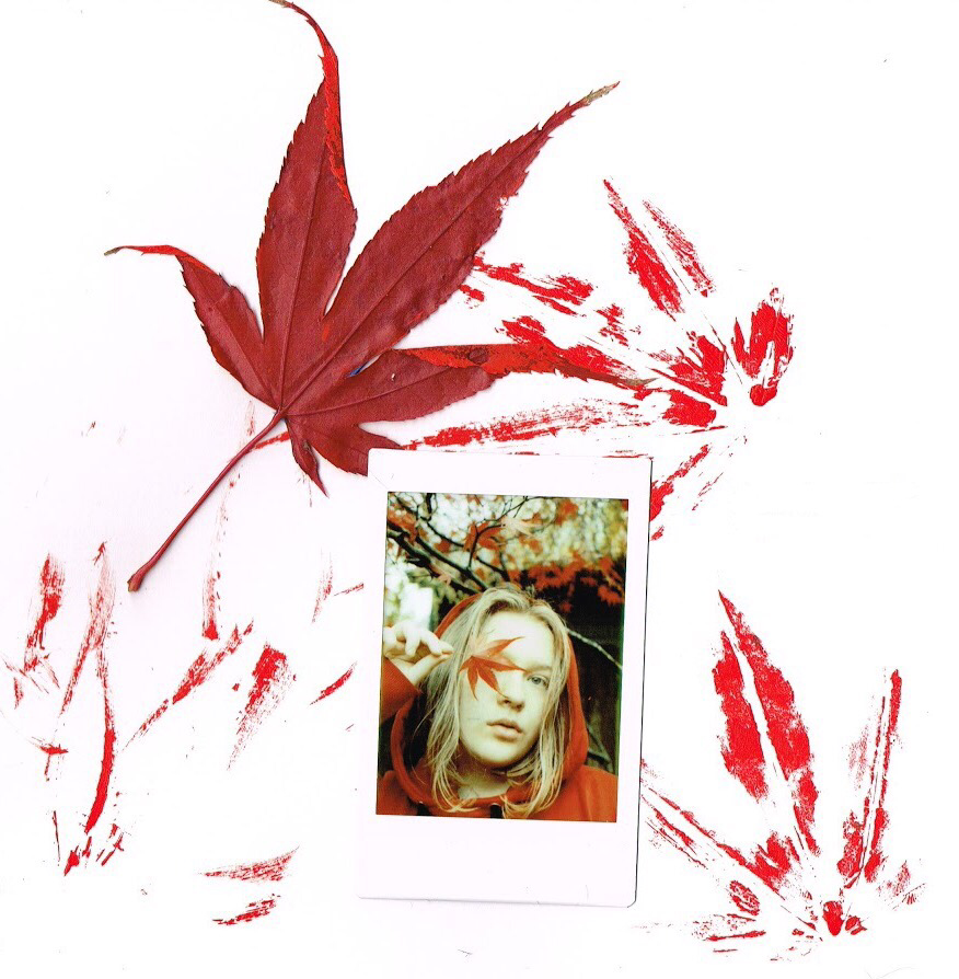
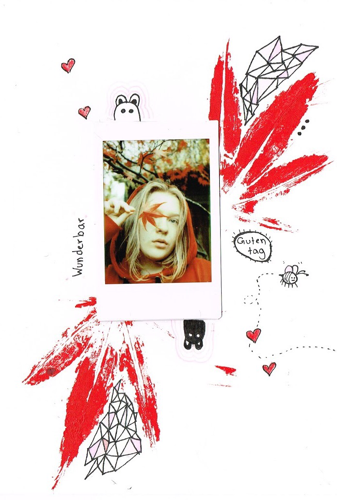
Polaroid with maple leaves
11/25/17
Project: Self run
Artist statement:So on this nice quiet Saturday, I got a little creative spark and decided to experiment with a picture I took last week. I printed the picture to be a Polaroid and began the creative process. I first went outside and got a maple leaf from the same tree where I took the picture and got out the Cadmium red acrylic paint. I then proceeded to paint the acrylic paint onto the leaves and stamped it on the paper to make a background. For the first picture, I left it as that, including the actual leaf used. On the second picture, I decided to add some doodles to the picture to give it a little spice. Overall I had a fun time experimenting with everything, and learning how to use the scanner on our printer.
|
|
Name logos |
10/6/17
Project: Self run
Artist statements: I created these logos as mainly a concept, and to practice graphic design and logo making. I tried different fonts on these, colors and angles. I feel both of these turned out great, and it helped me learn Photoshop better.
Project: Self run
Artist statements: I created these logos as mainly a concept, and to practice graphic design and logo making. I tried different fonts on these, colors and angles. I feel both of these turned out great, and it helped me learn Photoshop better.
|
|
Magazine cover concept
10/4/17
Project: Self run
Artist Statement: This magazine cover concept was to practice the look of a real magazine cover. I was playing around with the layouts, fonts, and colors. I especially spent a good time arranging what picture I would use as the front cover. I enjoyed making this concept, and I hope to make more in the future.
Caption on the magazine: "A local art magazine showing the pictures of the inspiring visual artists of tomorrow."

Wood Cookie Art
Created on 9/24/17
Project: Self run
Objective: For Outdoor school, each counselor goes by a name that is not their own. Its been the long-standing tradition because it allows the kids to remember everyone "Wood cookie name".A lot of thought goes into the making of the wood cookie and picking of the name. For me, I wanted a name that was unique that I have never heard before and to symbolize/represent me. Being I am a photographer, and I have hundreds of Polaroids, it only fit that was my name. Each session you get a new wood cookie to create. As I am a returner (I have done Outdoor School more than once) I get mine in advance, allowing me to do wood cookie art as it is called. My first wood cookie had the same design as this one, but it was all sharpie. My steps for making this one were.
- Penciling out the lines of the rainbow pattern
- Painting the whole wood cookie white
- Painting around half of it black
- Made each of the colors of paint and painted it on
- I then printed out the Polaroid logo super big
- Cut both the name logo and the square logo out and super glued
- Put colored glitter glue that correlated with the color of paint
- Finished it off with a water sealer so that it would be safe in the rain


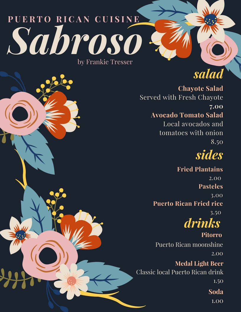
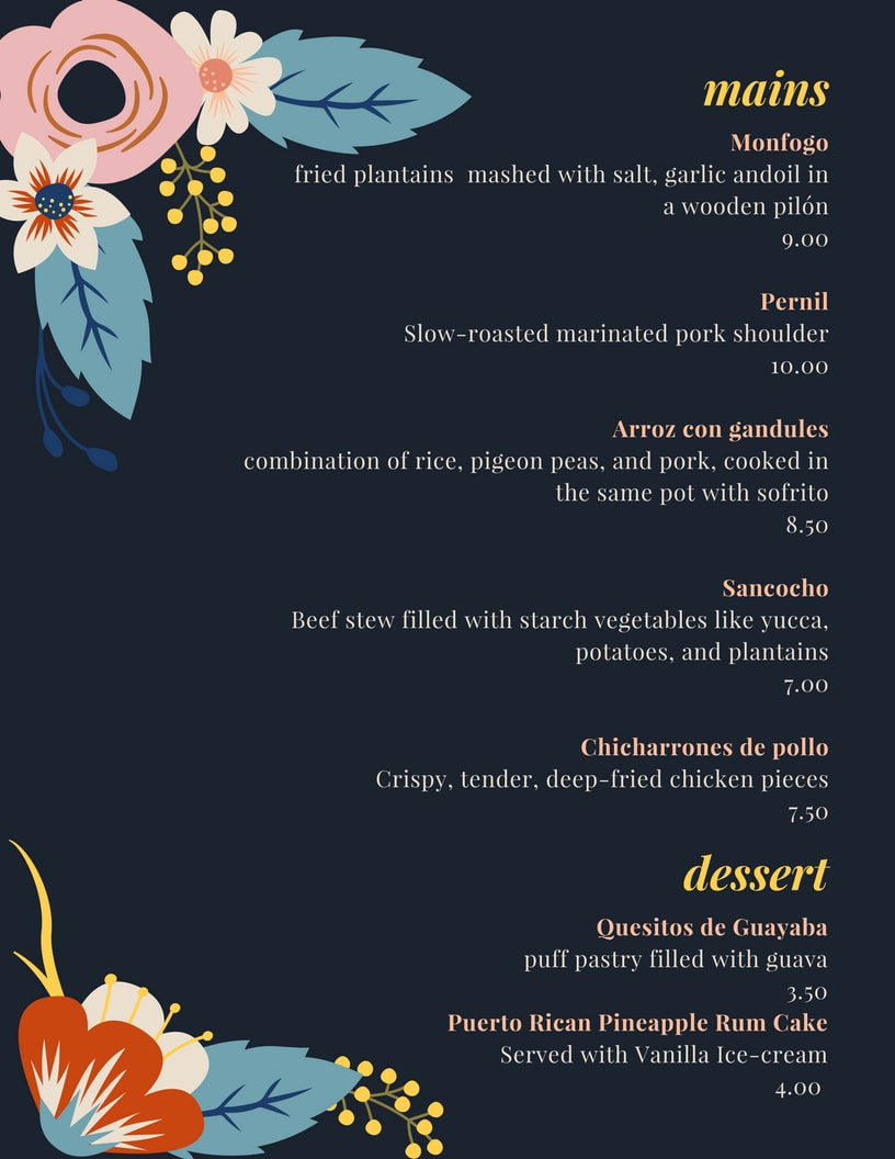
The Puerto Rico project
10/4/17
Class:Ethnic Studies
Project: Class assignment
Objective: The task for this project was to research and show a part of Puerto Rico's culture in a form of our choosing. For me, I felt it would be really cool to show some of the traditional food items commonly made in Puerto Rico, and make it a food menu for a possible restaurant. I researched some food items that looked really tasty (Hence the name Sabroso which means tasty in Spanish). I designed a Menu with these traditional dishes, giving a little blurb about what is in it which gives the viewer an idea of some of the cuisine items.
|
|
Popsicle Stick art
3/23/17
Class:3D art
Project: Class assignment
Objective:This was a project meant to create either a popsicle stick bridge or something of our choosing, so not doing a bridge I decided to make a little house. We were limited in hot glue, so we had to paint the popsicle sticks all together with elders glue, then I use a hot gun (Super power hair dryer) so we could dry it quicker. I then pieced each part together making it a complete house. Towards the end, we got more glue sticks so the flooring and the roof are a mix of hot glue and Elmer's glue. I then made some flower baskets to go on the side and painted the door blue with a gold heart. My favorite touch is I the chimney. My teacher had a wine cork that I cut to fit on the roof. For the fake smoke that is coming out of the cork chimney, I grabbed a ziplock bag from my lunch, ripped it up and hot blued it to make it look like it was coming out of the chimney.
Showcased: In main hall art showcase


Wire Identity Sculpture
3/12/17
Class:3D art
Project:Class assignment
Name of art Piece:Edelweiss
Objective/Artist statement:"I formulated an abstract sculpture using three descriptive words to represent identity. Words that describe me are edgy, unique and colorful. The bare wires in the back of the crown showcase my edgy side, yet it also represents my vulnerability. The butterflies personify the colorful side of me; I consider myself an individual and I like that every butterfly has its own patterns."
Honors:This project is probably my most proud being the honor that it received. The project that I created was picked by my art teacher to represent my high school to be in the HeART of Portland exhibit located at the Portland Art Museum. The HeART of Portland is a major event that showcases an ambassador from each PPS(Portland Public schools) who was chosen by an art teacher. The event reached around 600 people for the opening day of the exhibit. My crown was front and center in a glass case, with many people drawing towards it. It was a really special moment being that my art piece was in an actual art museum that showcased many famous artists. This exhibit lasted for a week, with many visitors to the museum seeing it. I remember listening to the conversations people had about it and it was so special to see this art piece I worked so long and hard on being in a huge art museum. Before it was in the art museum also it was put in the front showcase of my school. I still am so thankful and proud I got this opportunity.
Cardboard chair
11/12/16
Project: Class assignment
Class: 3D art
Objective: In this project, we worked in groups to create a workable chair out of recycled cardboard. In this project, we had done many measurements to ensure that all pieces would fit together. The chair had to be able to last a five-minute sit test (And it sure did!). Over the course of six classes we cut, hot glued and made sure that the chair was aesthetically pleasing to the eye, but also to be comfortable as a normal chair. I created the design on the chair by taping it making shapes and painting them the three colors we chose. The final product looked great, and also was super comfortable to sit in. It defiantly was a challenging project but it taught me how to properly measure, create blue prints then be able to take those and make the real thing.


visibility:hidden;
display:none;
visibility:hidden;
display:none;
